6.8 Time Series Analyses
Disclaimer |
|
|
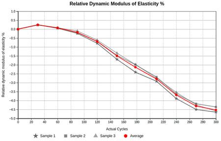
BackgroundSome labs capture results over a period of time for tests on the same Sample, studying and interpreting a sequence of data points recorded or collected at consistent time intervals e.g. ambient lab temperature, weather records, patient health evolution or physical strength tests in engineering Consider an example where the percentage mass change of 3 similar drying concrete bars are regularly measured, tabled and eventually graphed including of their average Using Time Series Analyses...After it was set up, see overleaf Spreadsheet format
|
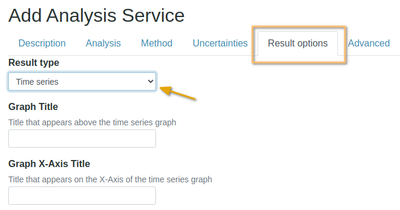
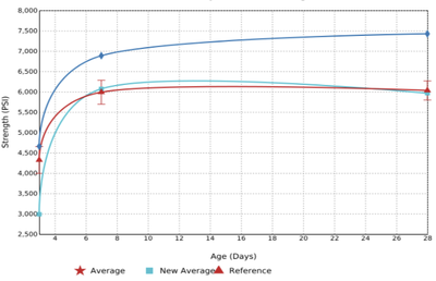
Setting up a Time Series Analysis ServiceFor the given example to Analysis Services, and Crete a new one. After completing all its standard attributes, open its Results Options tab Select Time Series as a result Type Graph Smoothing and ColoursYou can also select the type of interpolation you want Basis smooth, the line does not necessarily pass through the given data points Cardinal smooth, the curve always passes through the given data points Linear spiky, connects each pair of points with a straight line
|
Set up the Time Series Importer...Data Table DefinitionProceed to lay out the graph by defining its columns and an Index to which the graph will be plotted to - the x-axis, drying cycles in this example NB There has to be an Index row, select it on the Column Type lookup which will be the X axis units in the spreadsheet to be imported for the Analysis Follow up with the data columns, these are the lines that will be graphed - give each the Data column type and appropriate title If the value is a whole number, select Number for the Data Type, Float if it is a rational number that includes a fraction If it is an Average, select that as Column type - it will be used to differentiate it in colour from the other data lines You may also add Error Bars to Average curves, and table some results and Hide them without plotting them Assign custom colours to lines in the right hand column. If no colour is given, the line won't be drawn and just it's data points plotted |
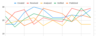
ColoursThese are from the Tableau 10 palette, designed for readability and data visualization. They are balanced so each color is distinct against white and against each other Teal #17becf Olive #bcbd22 Gray #7f7f7f Pink #e377c2 Brown #8c564b Purple #9467bd Red #d62728 Green #2ca02c Orange #ff7f0e Blue #1f77b4 |
Google's also works well, e.g
|
In Text to copy: #3366CC, #DC3912, #FF9900, #109618, #990099 #0099C6, #DD4477, #66AA00, #B82E2E, #316395
|


